A brief of one line
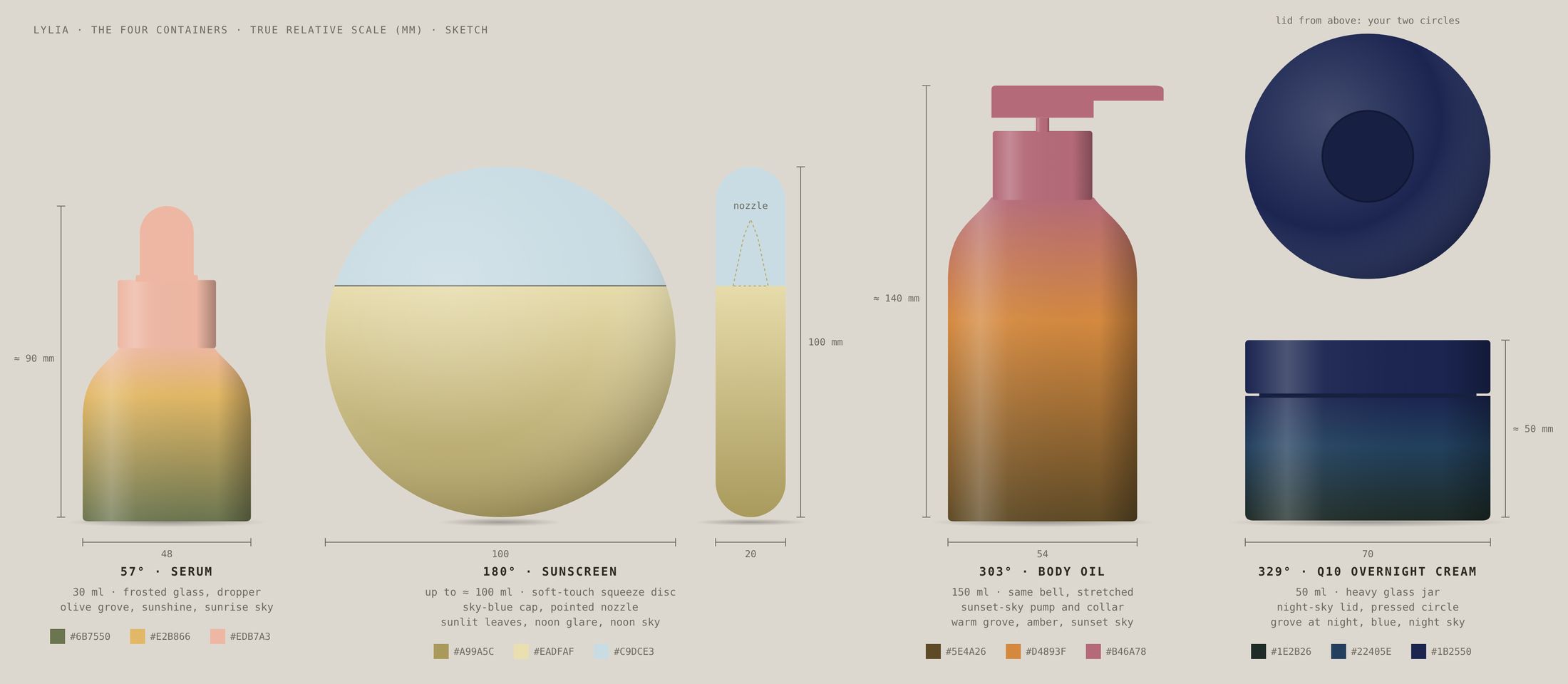
The brief came down to one line: one olive tree, one day, four products. Every decision after that was a way of not breaking it. The first sketch put the four containers at true scale and dressed them in the colours of the sky.
Olive oil skincare from Bar, Montenegro. Four products, named after four positions of the sun on the longest day of the year.
Identity, typeface, glass, packaging, pictures and voice by Fjaka Design Studio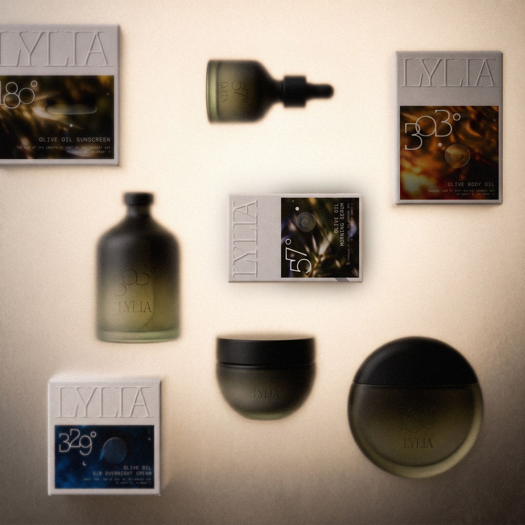
Set like the menu that started it: numbered big enough to read from the door.
Skincare usually sells a routine: ten steps, three serums and a toner nobody can explain. LYLIA sells a day, the longest one of the year. On 21 June in Bar, where some olive trees are older than anything written about them, the oil comes from Žutica, the local olive, and the sun does the rest.
Each product belongs to an hour, and each hour has a bearing, the exact point on the compass where the sun stands. The serum is sunrise at 57°. The sunscreen is noon, due south at 180°. The body oil is sunset at 303°. The night cream belongs to the hour after dark, when the sun has slipped to 329°, eighteen degrees under the horizon.
We didn’t name the products. We looked up where the sun was.
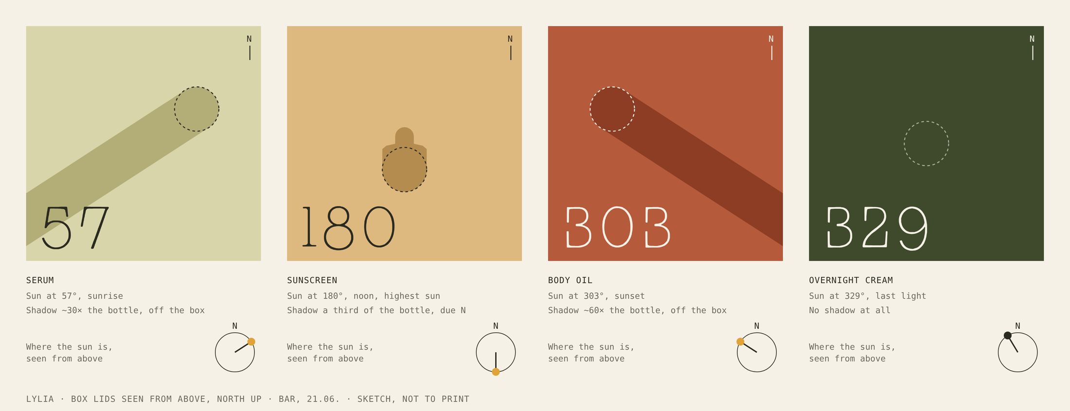
Move through 21 June in Bar. The ring is the compass with north at the top, the dot is the sun, and the shape in the middle is the product of the hour seen from above, casting the shadow it really casts. Every box was drawn from this.
Sunrise. The serum.
Positions are calculated for Bar (42.09° N, 19.10° E) on 21 June 2026, Central European Summer Time. North is always the top. The pictures follow the same rule, which is why the sunrise shadows run to the lower left and the sunset shadows to the lower right.
The palette follows a single olive from morning to night: green at sunrise, oil-gold at noon, fig-violet at sunset, almost black after dark. Around it are two stones from the coast and one black that is really an olive. Each hour colour belongs to one product and is never lent to another. Colours are always flat, because the light already makes the gradients.
Pick a ground and a type colour. The ratio is the WCAG contrast; 4.5 is the floor for small print, 3 for anything set large.
Print: Limestone is the uncoated cotton board itself and takes no ink. Every other colour is matched to a Pantone on that board under daylight, never on screen. Screen: the values below are the masters.
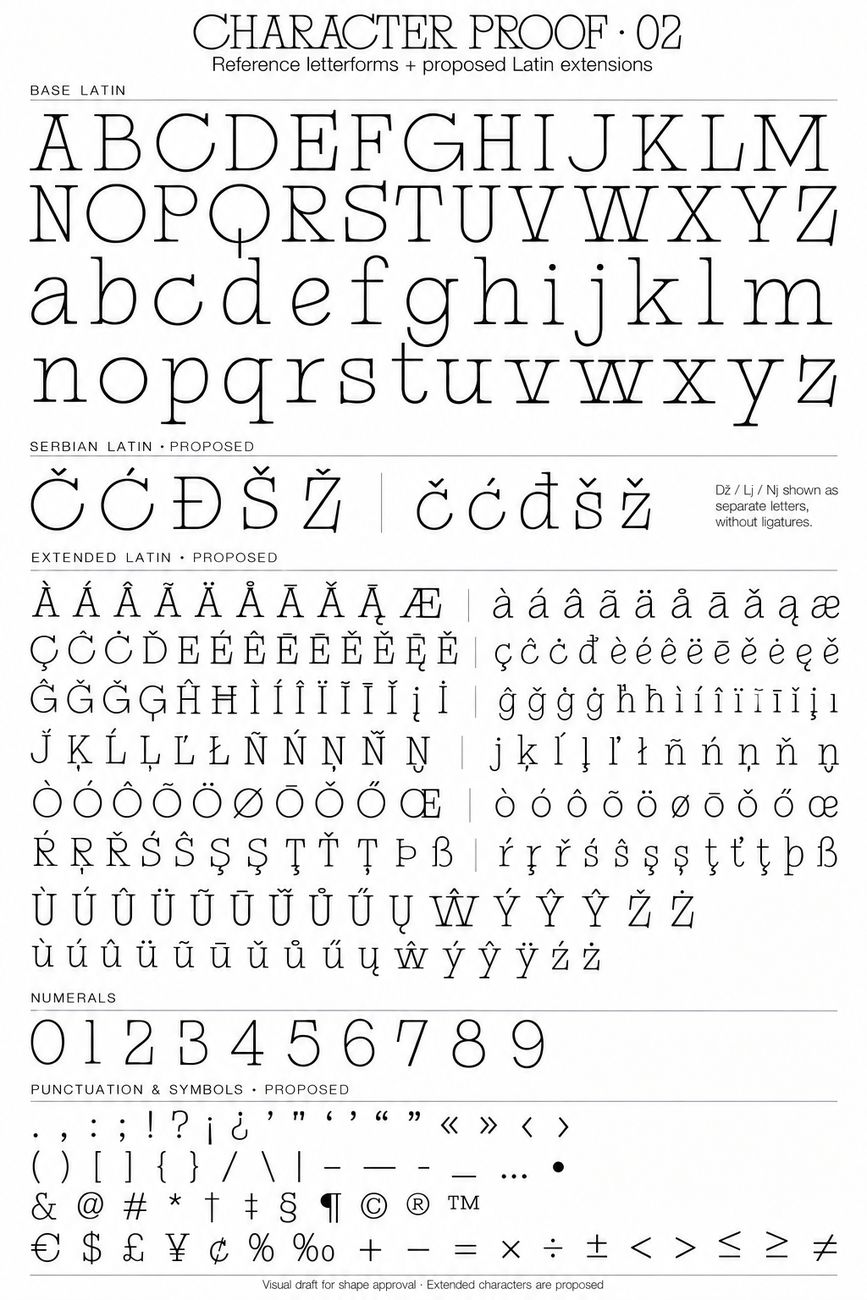
LYLIA Slab Serif is our own, drawn from an old film photograph of a 1970s restaurant: olive wallpaper, cane chairs and a menu numbered big enough to read from the door. It sets every name, number and line worth reading twice. IBM Plex Mono sets everything that has to be exact, like volumes, bearings, ingredients and the law.
The four bearings on the glass and the boxes are drawn, not typeset: one thin line each, the figures leaning on each other like an entry in a ship’s log. They are artwork, used only at their own size and place. Everywhere else, numbers are set in LYLIA Slab Serif.
The wordmark is LYLIA set in its own typeface and then drawn closer, so the first L slides under the Y. There is no symbol, because the four numbers already do that job. On the glass the wordmark is a window, the one part of the bottle left unfrosted. On the box it is pressed blind into the board, with no ink at all.
Olive Black on light grounds, Limestone on dark ones. Never outlined, shadowed, stretched or given a gradient.
On the boxes the wordmark is embossed without ink, so it shows only when light rakes across the board.
On the containers it is the one unfrosted area. Nothing is printed over it or around it.
No sun icons, rays or horizons next to it. The numbers carry the sun, so the name doesn’t have to.
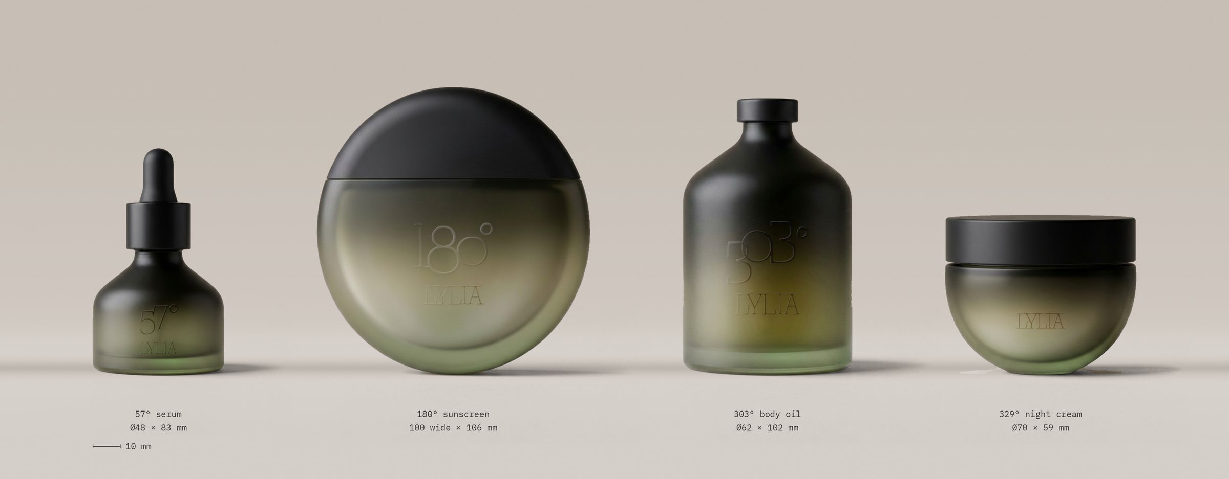
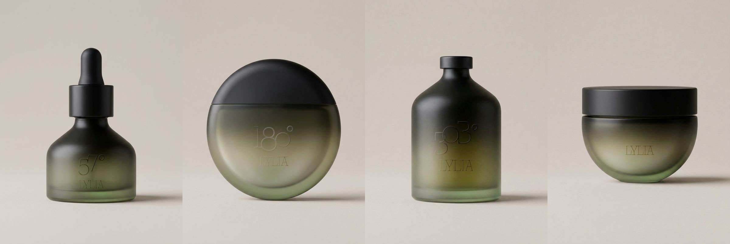
Every container is sandblasted until it’s soft to the touch and fades from the green of the grove at the base into black at the shoulder, the way an olive tree goes into shadow. Nothing is printed on the front. The name and the number are left polished, two clear windows that only show when light comes through. The back carries the least the law allows, in dark olive, on the pale band at the base.
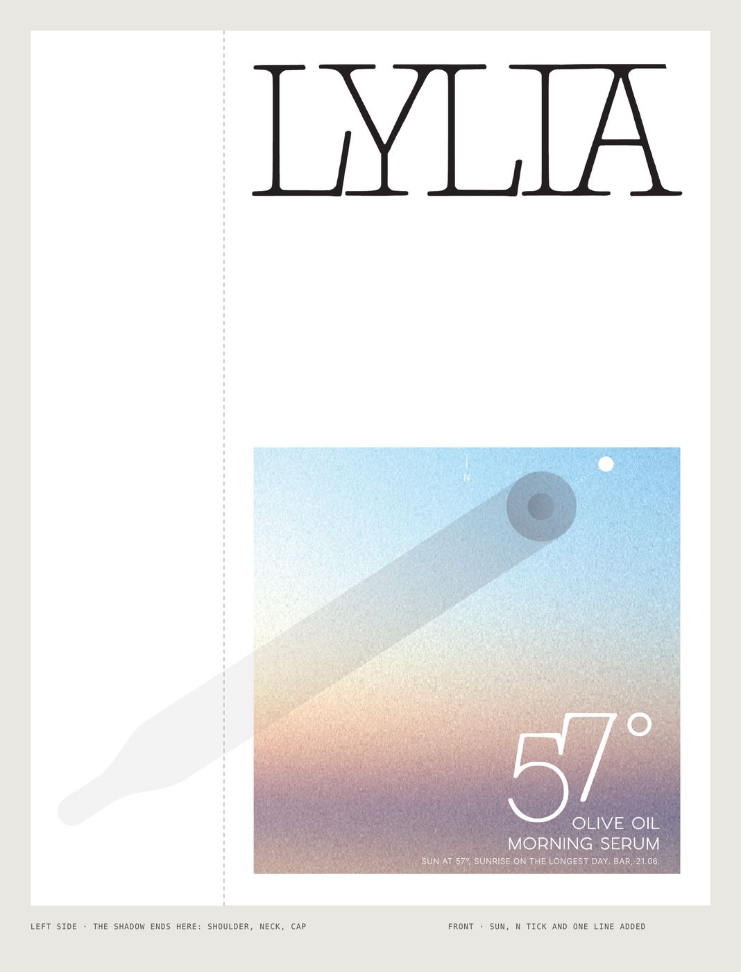
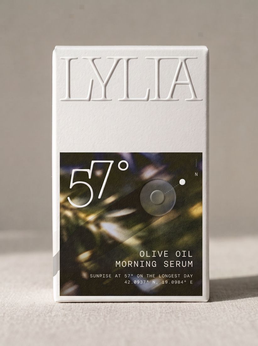
Each box carries the true shadow of its container at its hour, calculated from the sun’s real position over Bar: long and low at sunrise, a short stub pointing north at noon, long again at sunset, and at night no shadow at all. The board is thick felt-textured cotton. LYLIA is pressed in blind, each container’s silhouette rises from one side, and the back is set like a lab report, in English and Montenegrin.
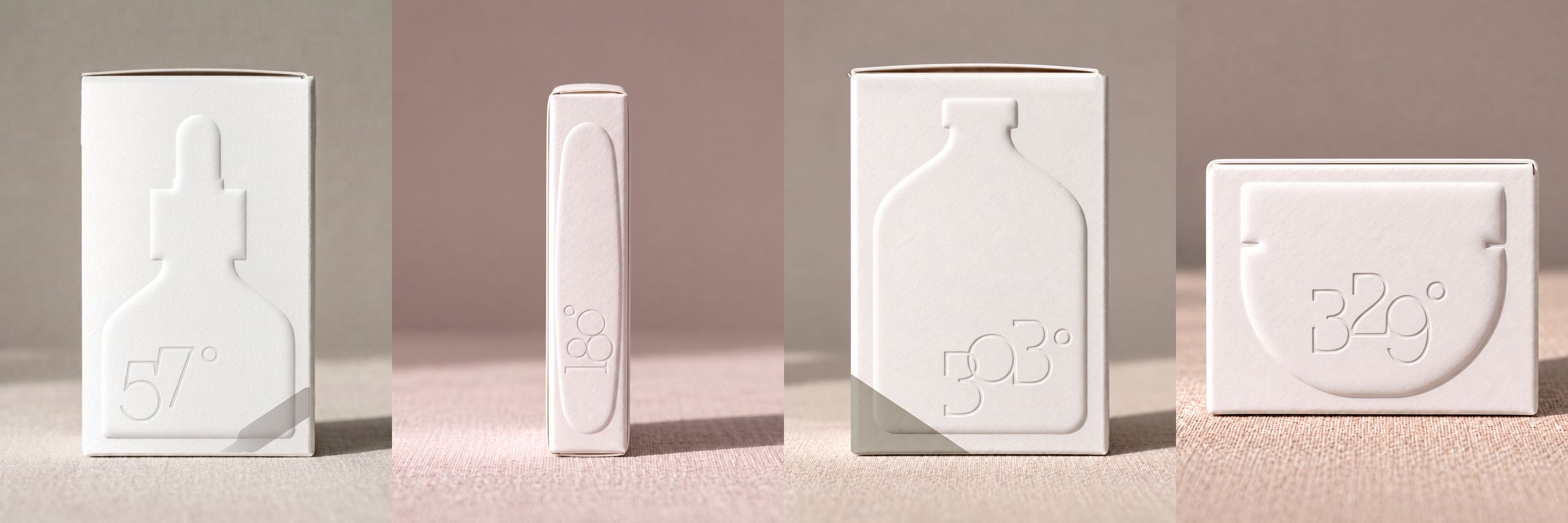
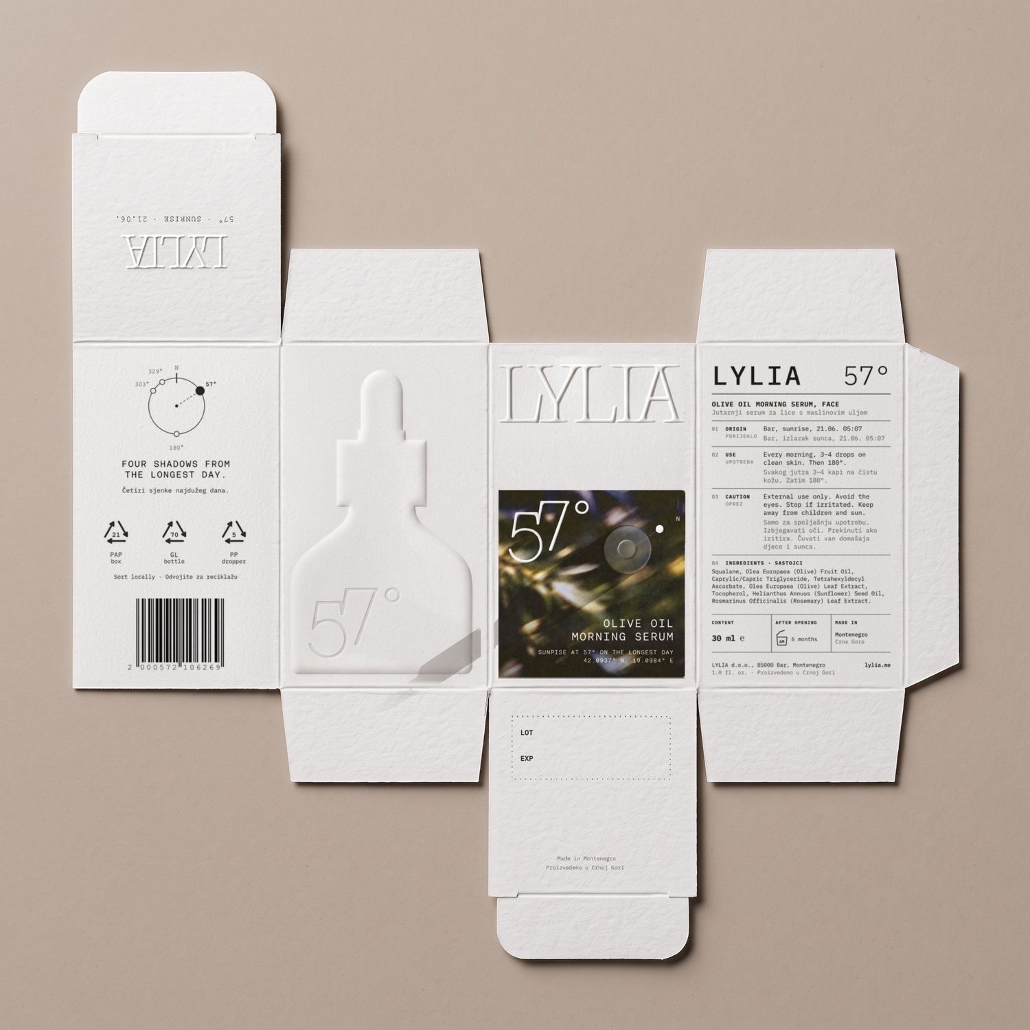
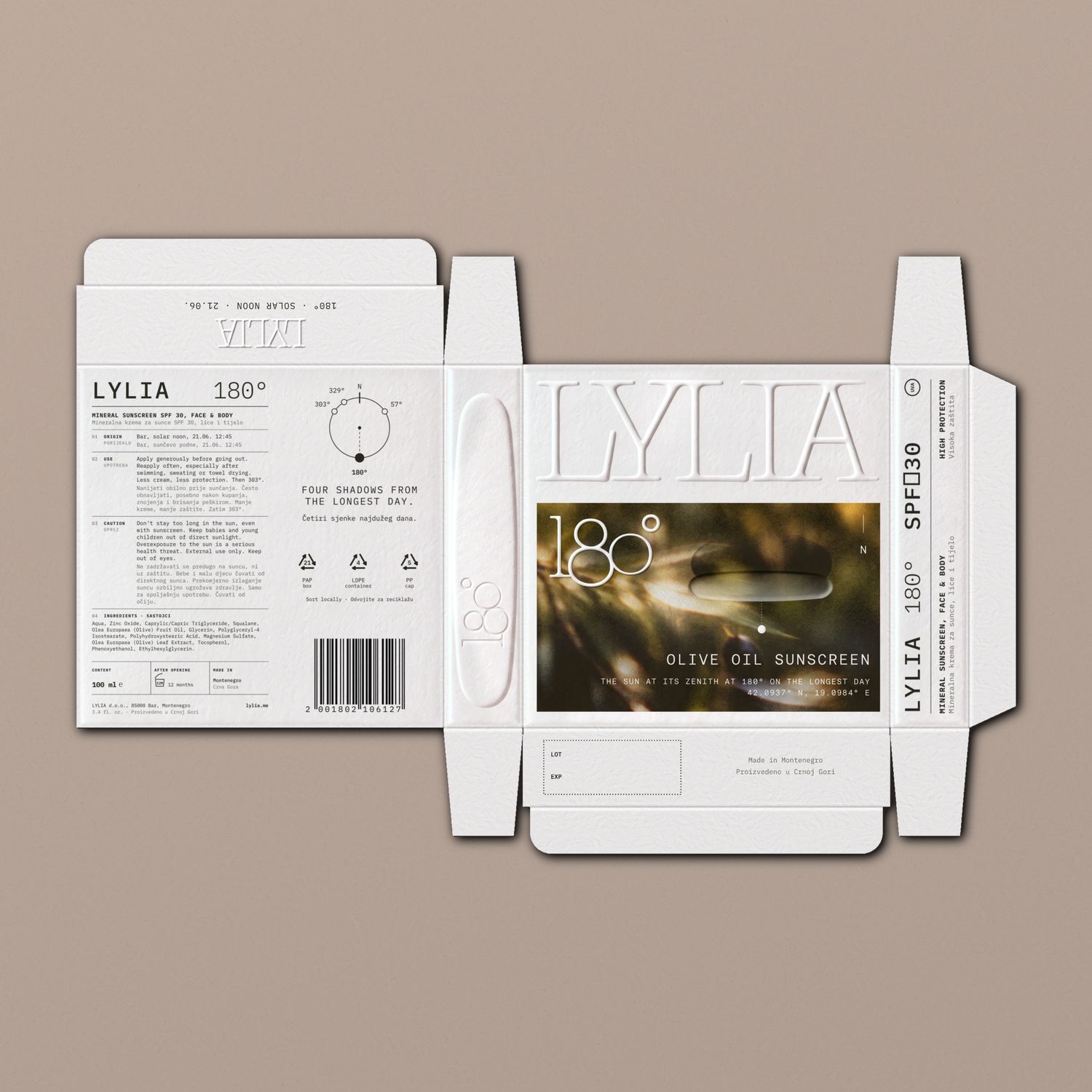
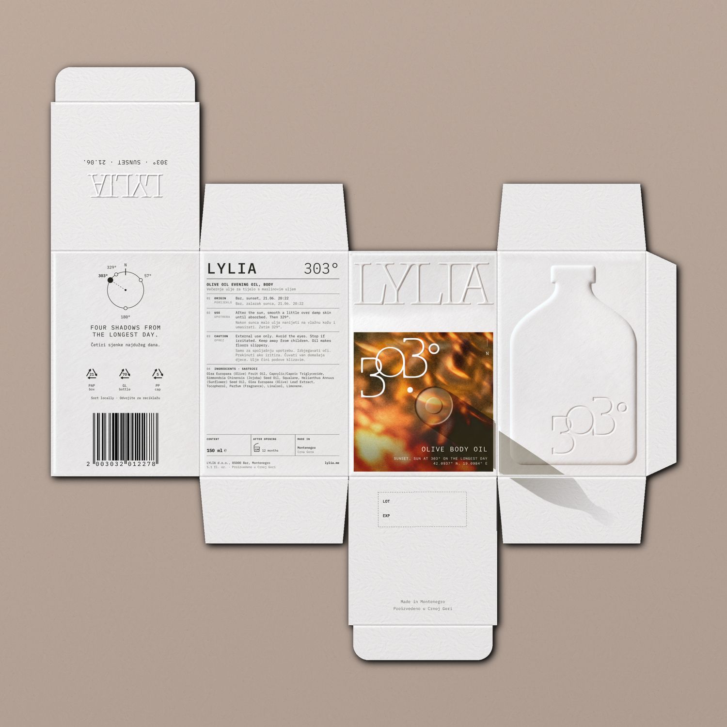
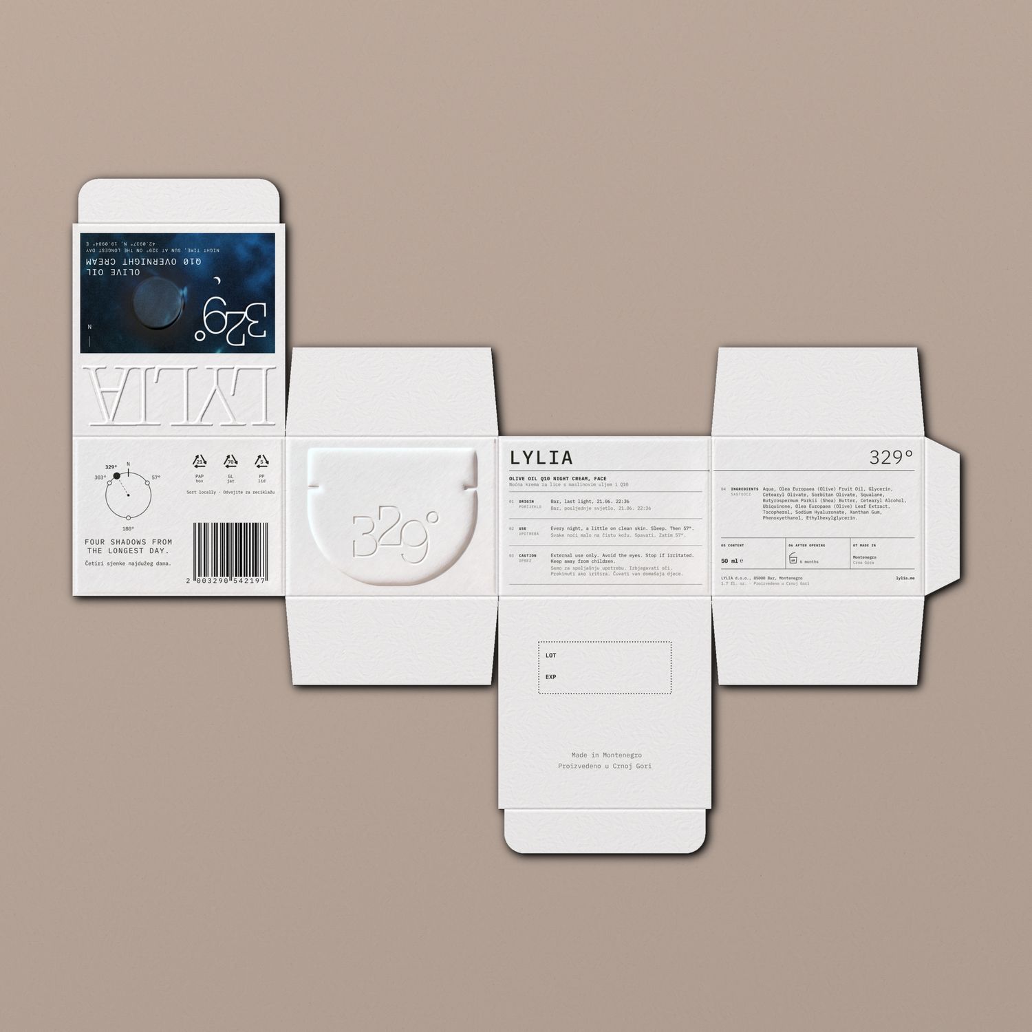
Four nets, one construction: tuck ends, no glue on the faces, no insert. Each box holds its container with a millimetre to spare on every side.
LYLIA is photographed in three series and only three. Each picture shows one moment, lit the way that moment is really lit.
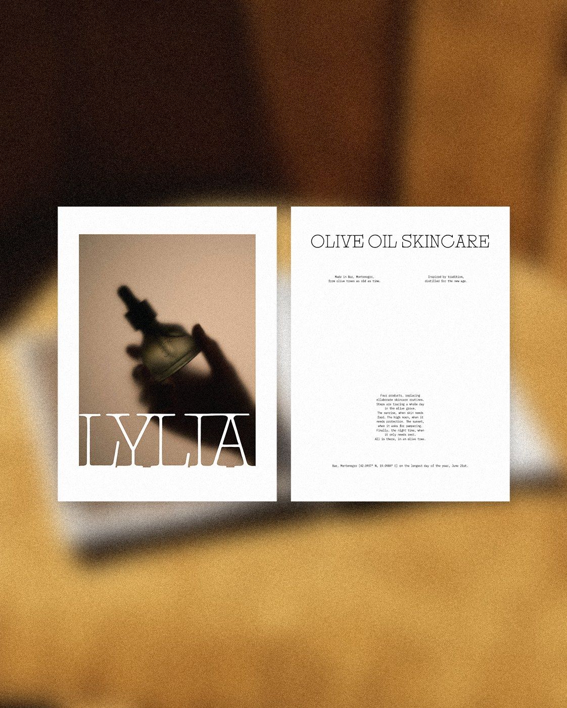
The products are pressed against frosted glass, close enough to read and too far to touch. There’s warm light and one object per frame, held by a hand that never quite comes into focus.
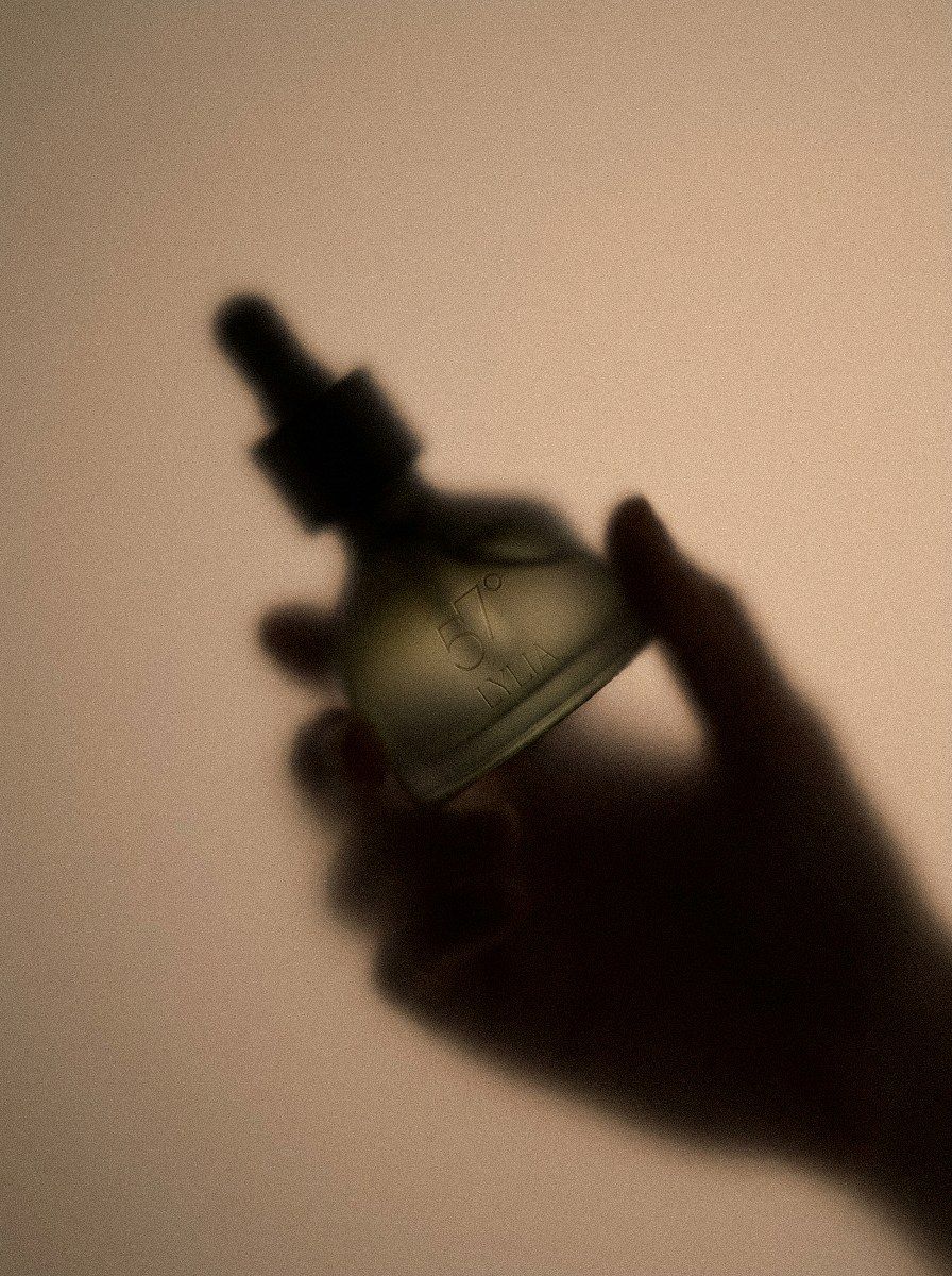
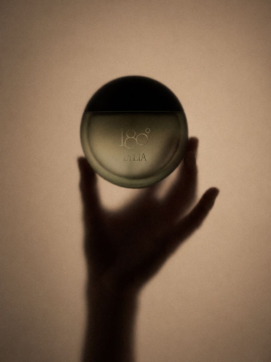
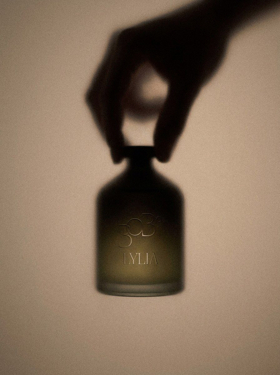
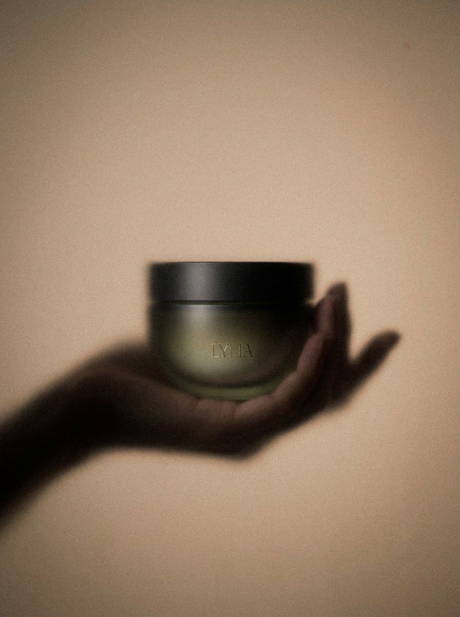
Each product is shot on limestone with olives at the ripeness of its hour, seen from straight above, with north at the top of the frame. At sunrise the shadows run long to the lower left. At noon they shrink to a stub. At sunset they swing to the lower right. At night only the moon lights it, from overhead, and nothing casts a shadow.
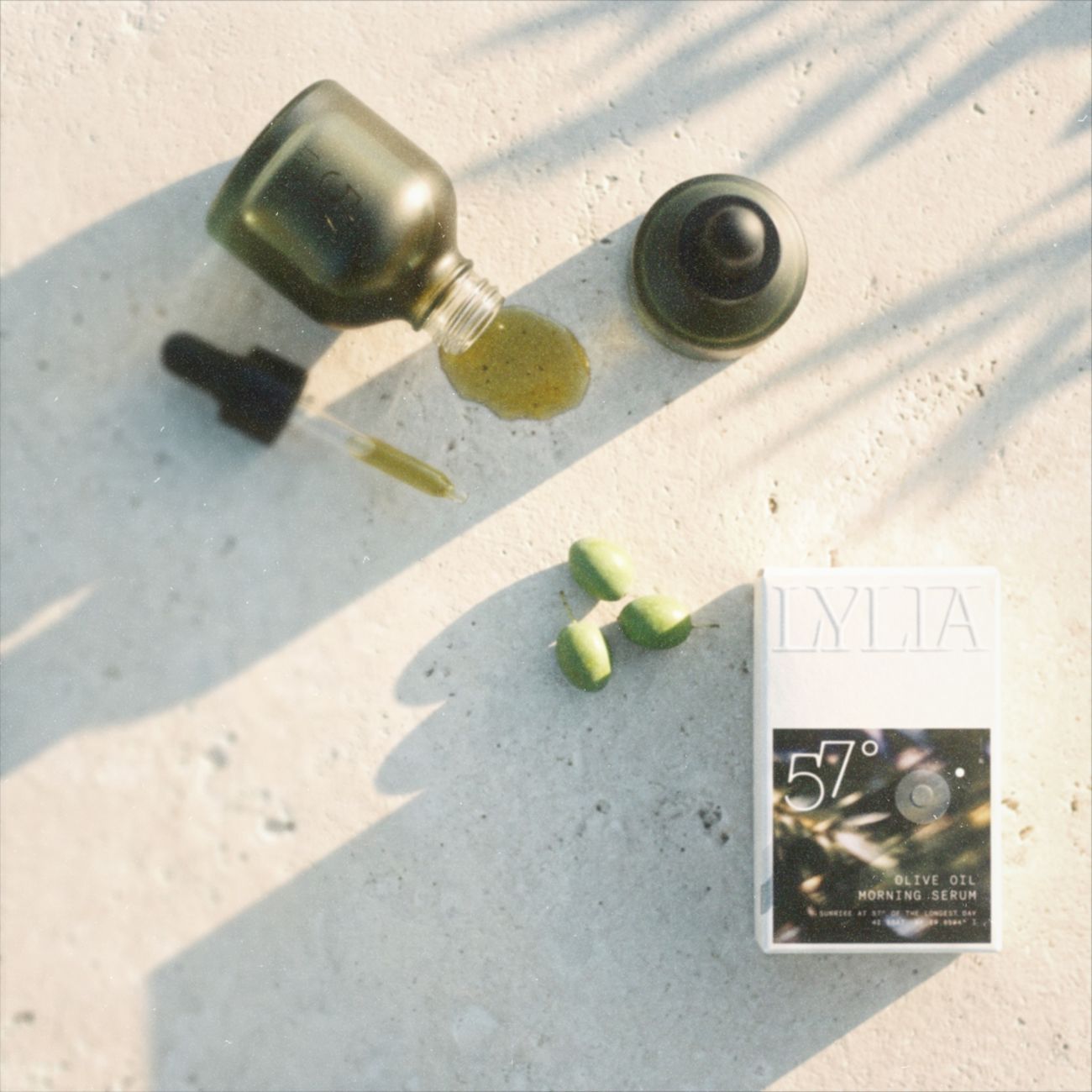 57° · 05:08 · Sunrise
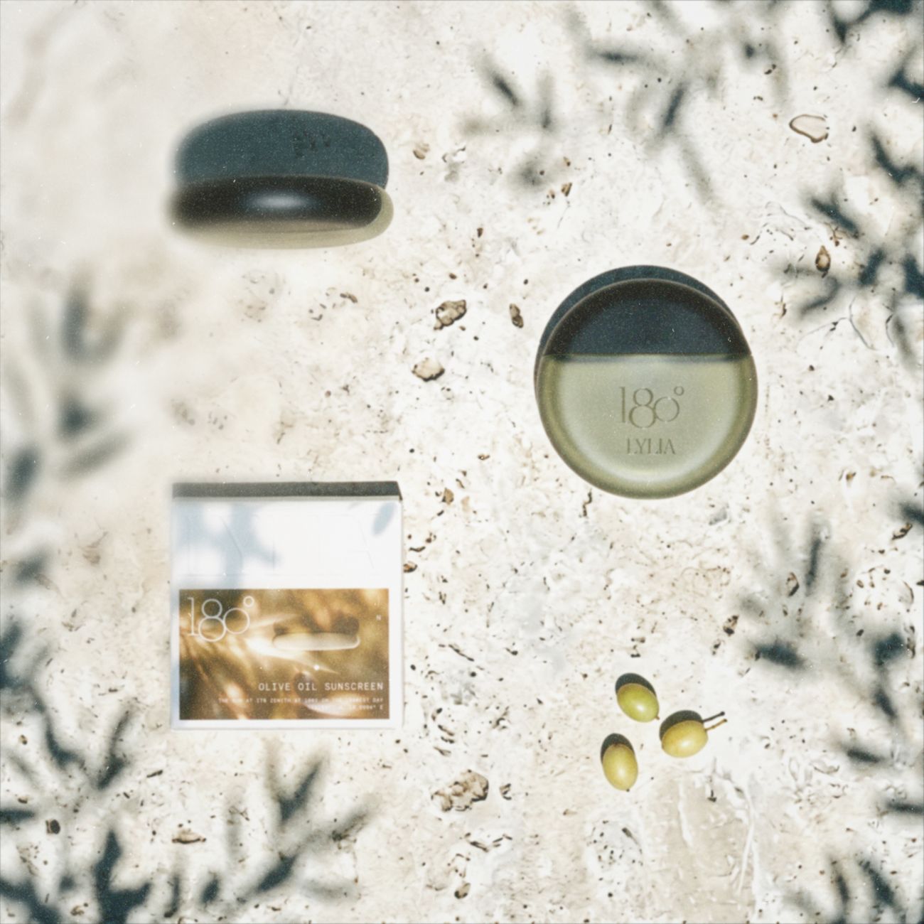 180° · 12:45 · Noon
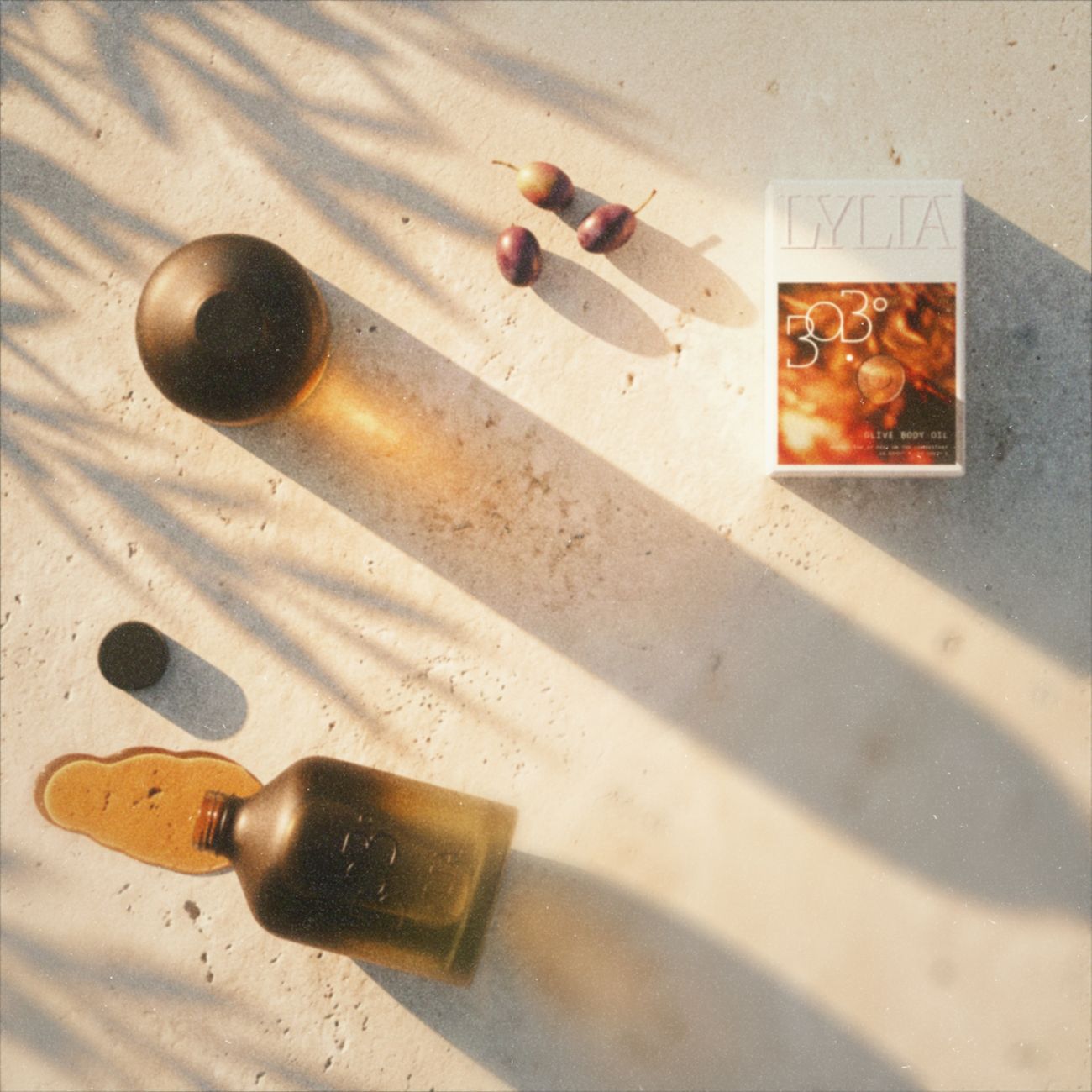 303° · 20:23 · Sunset
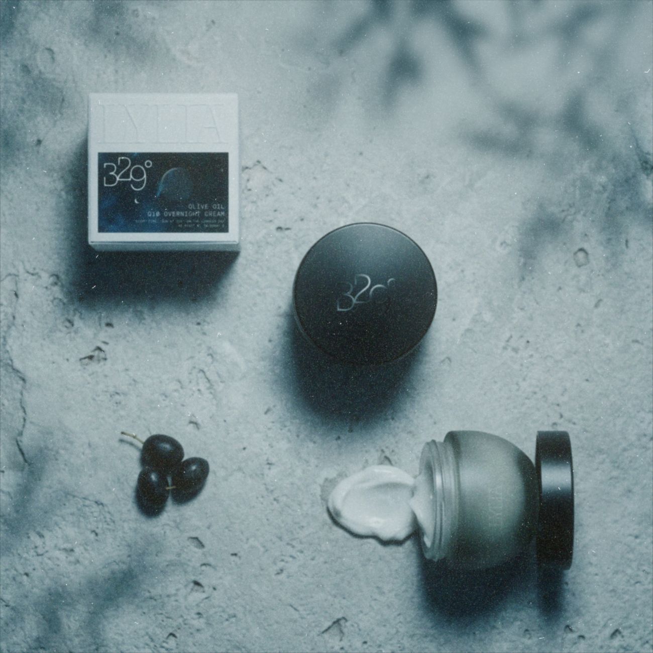 329° · 22:36 · Night
On the page LYLIA behaves like a magazine, not a catalogue: one picture, the wordmark set large, and the story on the facing page in small type with plenty of room around it.
Keep sentences short and put numbers before adjectives. Say where the sun is and what the product does, then stop. No glow, no ritual, no journey. Everything is written in English and Montenegrin, and the second language is never an afterthought.
A brand is mostly the things you decided against. This is the order we decided against them in.
The brief came down to one line: one olive tree, one day, four products. Every decision after that was a way of not breaking it. The first sketch put the four containers at true scale and dressed them in the colours of the sky.
The first names were clock times. Then we found that someone else already sells the hours. A clock time belongs to everybody, but a bearing measured from Bar on one day of the year belongs to us, and it’s more exact. So 05:08 became 57°.
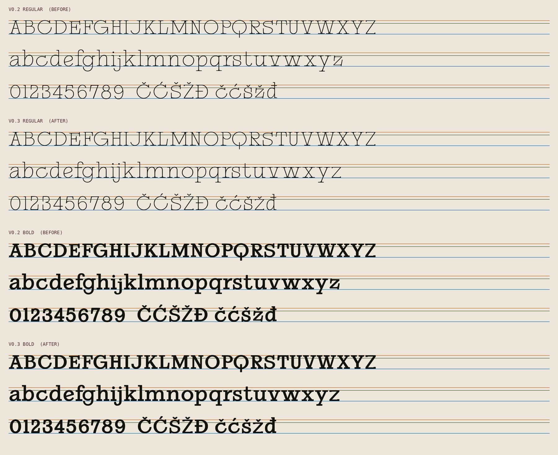
The reference was a single film photograph of a 1970s restaurant. We drew the letters from its menu, proofed them, and then spent longer than we’d like to admit making every letter sit on the same line and stand the same height.
It began in sky colours, one per hour. Then it went amber, like an apothecary bottle. Then we took the colour out altogether and used one glass for all four, grove green into black, and moved the hour to the box. Drag to see the last two side by side.
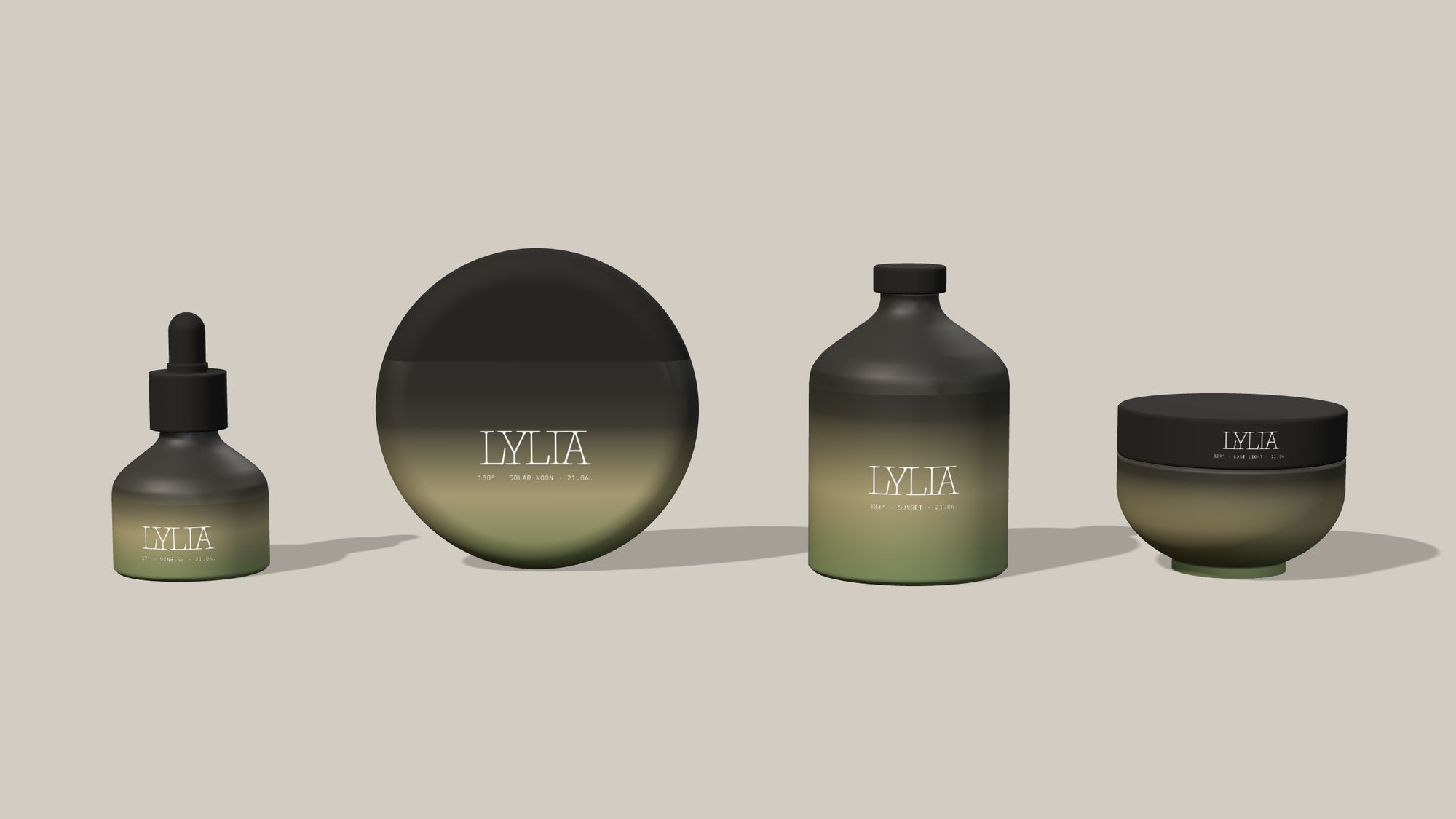
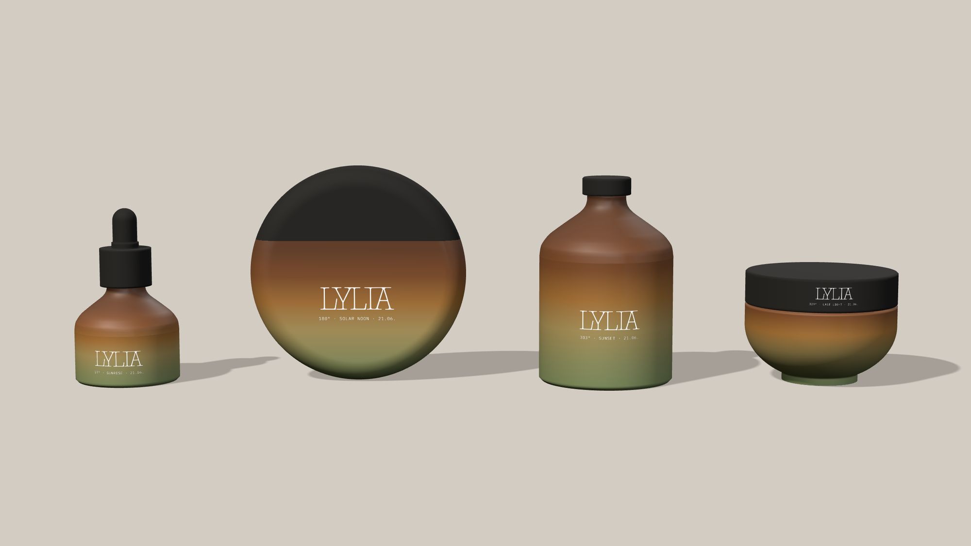
White print on frosted glass looked like a sticker, so we stopped printing. The wordmark and the number are left unfrosted and polished clear, and the bottle only reads when light passes through it. On the sunscreen, which is plastic, a clear gloss varnish does the same job.
Each box got the one thing a bottle can’t carry, its own shadow at its hour, calculated rather than guessed. The shadow is printed flat and runs off the front onto the side, where the board takes over: the container rises in blind emboss and the shadow ends at its shoulder.
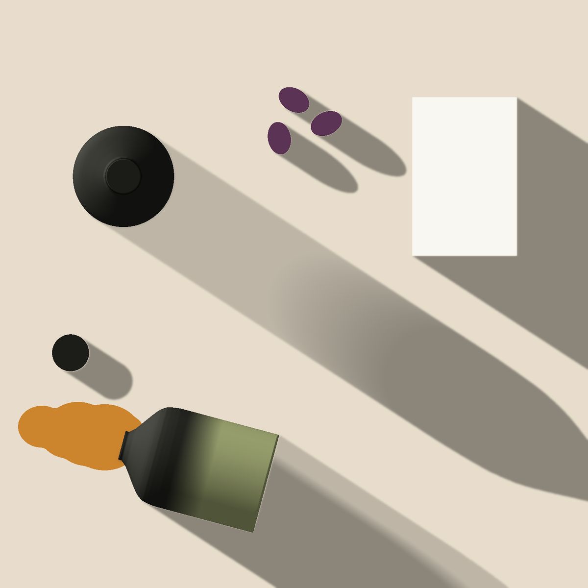
Before any picture is taken, we draw its shadows: every object at true scale and every shadow at the sun’s real angle for that hour, north at the top. After that the light only has to agree. Drag to compare the plan for sunset with the picture.
The whole system in one block of CSS. Paste it into a project and the colours, type and rules come with it.